
Our Favorite Moody Blue Paint Colors by Sherwin Williams

There is something undeniably timeless about a moody blue. It brings depth without feeling overwhelming, creates contrast while remaining sophisticated, and has the unique ability to make a space feel both elevated and inviting.
Whether we're designing a cozy home office, a statement powder room, custom cabinetry, or an intimate dining room, these are the blue paint colors we find ourselves returning to time and time again.

Sherwin Williams Sea Serpent (SW 7615)
If you're looking for a bold, dramatic blue that instantly adds personality to a room, Sea Serpent is one of our favorite choices. This deep navy has rich depth without feeling too saturated, making it an excellent option for creating a focal point.
Why we love it: Sea Serpent feels luxurious and timeless. It pairs beautifully with natural stone, warm wood tones, and unlacquered brass, creating spaces that feel layered and collected.
Best for: Home offices, kitchen islands, built-in cabinetry, accent walls
Designer tip: Balance its richness with lighter countertops, white walls, or warm wood flooring to keep the space feeling open and inviting.

Sherwin Williams Wall Street (SW 7665)

Wall Street is the perfect blend of blue and gray, creating a sophisticated neutral that works in almost any style of home. It feels polished without demanding all of the attention.
Why we love it: Its muted undertones allow it to complement a variety of finishes, making it one of our favorite "safe" moody blues when clients want color without committing to a vibrant navy.
Best for: Offices, mudrooms, built-ins, dining rooms
Designer tip: Layer in natural textures like white oak, linen, and woven accents to soften the depth of the color.


Sherwin Williams Web Gray (SW 7075)
Despite its name, Web Gray carries beautiful blue undertones that become more noticeable throughout the day. It delivers a dramatic look while remaining incredibly versatile.
Why we love it: It's bold enough to make cabinetry or walls feel custom without reading overly blue.
Best for: Kitchen cabinetry, bathroom vanities, laundry rooms, exterior accents
Designer tip: Pair it with crisp white trim and warm metallic finishes for a timeless combination.
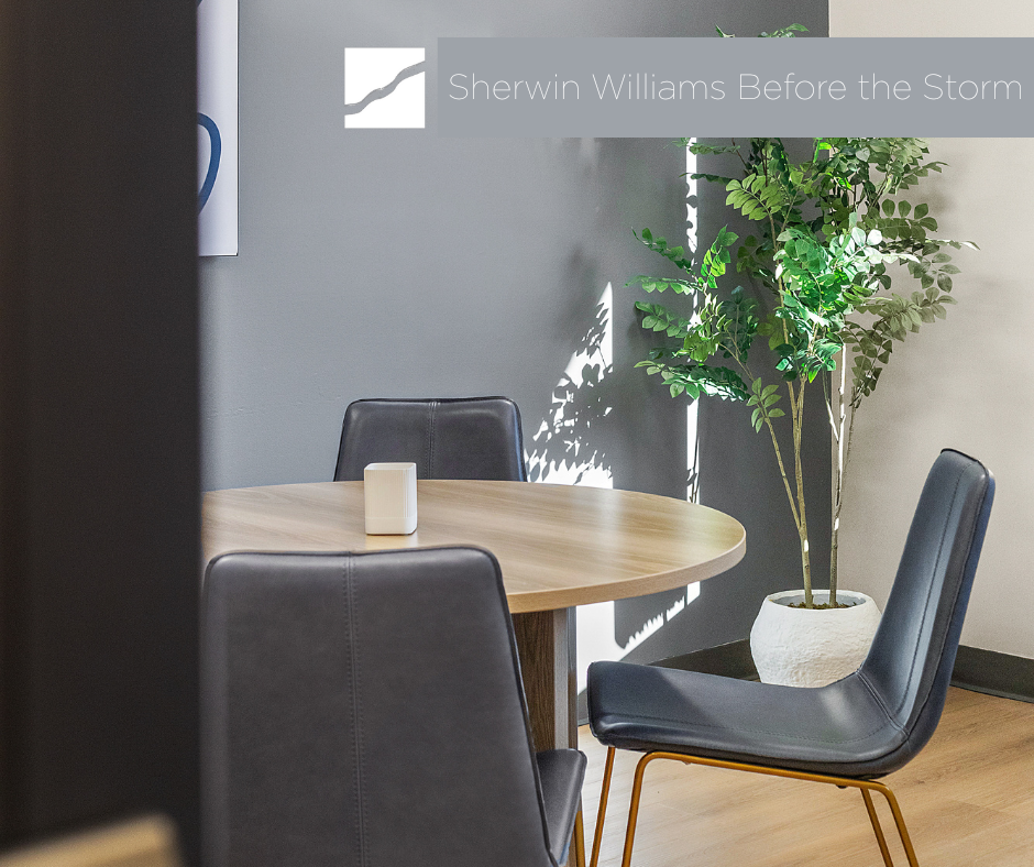
Sherwin Williams Before the Storm (SW 9564)
Before the Storm offers a softer take on a moody blue. It has just enough gray to keep it calm and understated while still adding depth to a room.
Why we love it: This color creates a cozy atmosphere without making a space feel dark or heavy.
Best for: Bedrooms, entryways, reading nooks, guest rooms
Designer tip: Layer varying shades of blue through textiles and artwork to create a calming, monochromatic palette.


Sherwin Williams Storm Cloud (SW 6249)
Storm Cloud is a rich blue-gray that feels classic and grounded. Depending on the lighting, it can lean slightly more blue or more gray, giving the room beautiful dimension throughout the day.
Why we love it: It creates an intimate atmosphere while still feeling refined and approachable.
Best for: Dining rooms, powder rooms, offices, feature walls
Designer tip: This shade shines in rooms with plenty of natural light, allowing its undertones to evolve from morning to evening.


Sherwin Williams Grays Harbour (SW 6236)
Grays Harbor blends deep blue, gray, and subtle green undertones into one incredibly versatile color. It's dramatic without feeling trendy, making it a timeless choice for both traditional and modern homes.
Why we love it: It has an effortless richness that works equally well on walls, cabinetry, and built-ins.
Best for: Kitchen cabinets, laundry rooms, mudrooms, libraries
Designer tip: Pair it with creamy whites, natural wood, and antique brass for a warm, collected look.

Sherwin Williams Slate Tile (SW 7624)
Grays Harbor blends deep blue, gray, and subtle green undertones into one incredibly versatile color. It's dramatic without feeling trendy, making it a timeless choice for both traditional and modern homes.
Why we love it: It has an effortless richness that works equally well on walls, cabinetry, and built-ins.
Best for: Kitchen cabinets, laundry rooms, mudrooms, libraries
Designer tip: Pair it with creamy whites, natural wood, and antique brass for a warm, collected look.

Sherwin Williams Slate Tile created a sort of jewel box enveloping this dining room
Tips for Choosing the Right Paint Color for Your Room
When selecting a paint color, it’s essential to consider more than just the swatch.
Here are a few interior designer-approved tips for choosing the right paint for your space:
Test before you commit: Always sample paint on your actual walls. Paint a large swatch (at least 12"x12") and observe it at different times of day. Light plays a huge role in how the color will actually look in your room.
Consider your lighting: Natural vs. artificial lighting can dramatically change how a paint color appears. North-facing rooms tend to make colors look cooler, while south-facing rooms bring out warmth.
Look at surrounding finishes: Your flooring, cabinetry, countertops, and furniture tones all influence how a paint color reads in a space. Make sure your paint choice complements these elements.
Sheen matters: For soft whites, a matte or eggshell finish creates a more subtle, elegant look, while semi-gloss or satin is ideal for trim and areas that require easy cleaning.
By following these best practices, you'll be able to choose a paint color that not only looks beautiful but also enhances the overall mood and functionality of your room.
Bonus Tip: Need Help Choosing the Right Paint?
Color decisions can feel overwhelming, and that’s where we come in. Our 90-minute design consultations are perfect for those quick-turn projects where you need expert guidance but aren’t quite ready for a full-service design package. Whether it’s choosing the right paint, rearranging your furniture, or giving your space a new sense of direction, we’ve got your back.
Ready to explore more? Browse all of our design services Get inspired by past projects And sign up for our newsletter for fresh design ideas delivered straight to your inbox.


Comments